Case Study · 0→1 Product

Workshop 2.0

Moving workshop delivery off spreadsheets and messaging apps and onto a platform that scales to more than 20,000 students across multiple campuses.

Lead Product Designer · Solo TUMO Center for Creative Technologies Web 🔧 In Development 2022–2023
BUILD CURRICULUM Workshop Designer Drag-drop builder · Versioning DELIVER SESSION Workshop Leader Presentation mode · Timer Dual-view TRACK LEARNING Students · Phase 2 Submissions · Feedback Attendance
At a Glance
CompanyTUMO Center for Creative Technologies
ProductWorkshop 2.0, a workshop management platform
Users20,000+ students · 100+ workshop leaders · 7+ campuses
TeamSolo designer, full product lifecycle
Duration2022–2023
My RoleDiscovery · Research · IA · UX Strategy · Design System · Delivery
Key DecisionSeparate interfaces for Workshop Designer and Workshop Leader
OutcomeArchitecture approved by leadership · Platform handed to engineering
Why This Mattered
Problem

Workshop delivery ran on spreadsheets, Drive, and messaging apps. Curriculum consistency was unenforceable. Leaders spent 15–30 min per session on manual prep and file troubleshooting, before any teaching began.

My Contribution

As sole designer, I led discovery, research, architecture, UX strategy, and delivery. Defined the role-based platform architecture. Designed Workshop Designer, Workshop Leader, and the TUMO Design System.

Outcome

Architecture approved by CEO, CPO, and engineering. Platform designed end-to-end and handed to engineering. Foundation built for 20,000+ students across 7+ campuses.

The Work
Three deliverables. One platform.
Workshop Designer · Workshop Leader · Design System
Workshop Designer
Workshop Designer
Content builder · Session structure · Versioning
Workshop Leader
Workshop Leader
Presentation mode · Timer · Dual-view
TUMO Design System
Design System
TUMO DS · Shared across all products
Outcomes

What was delivered

Workshop 2.0 was in active development when I transitioned to Adobe. Outcomes here reflect delivery milestones, stakeholder alignment, and implementation progress. Launch metrics were not yet available.

  • Architecture approved by leadership. Role-based separation and the dual-view system were signed off by engineering, the CEO, and the CPO
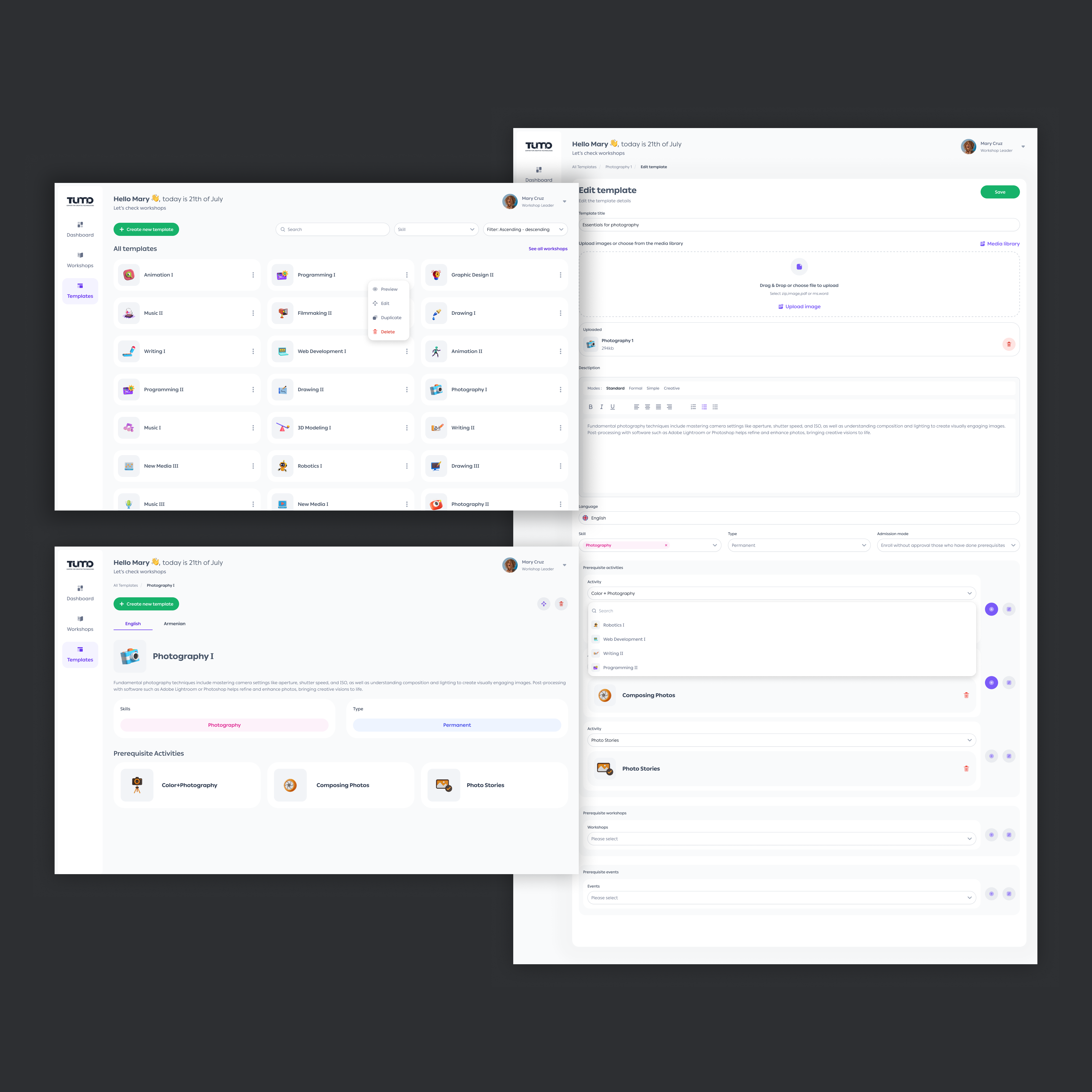
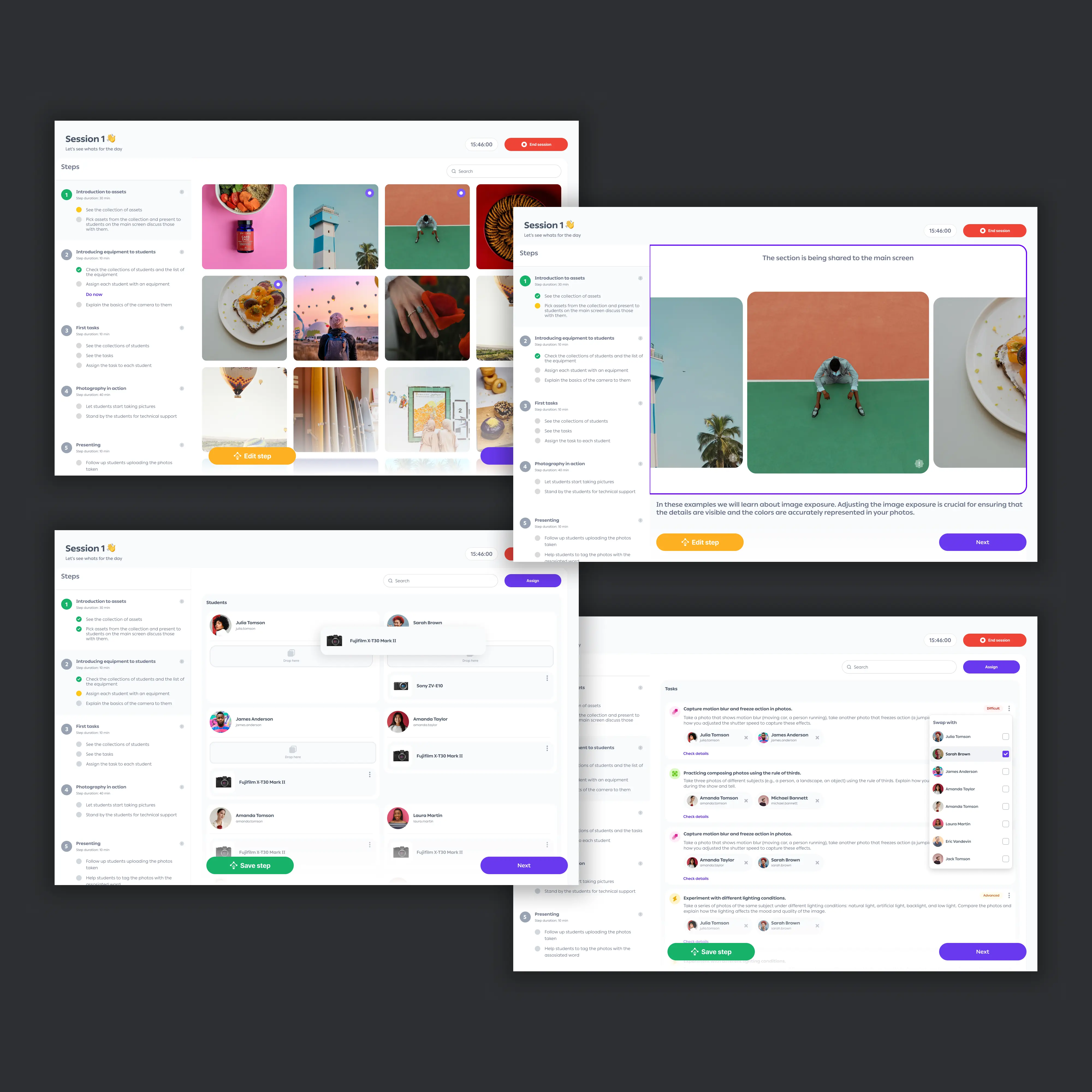
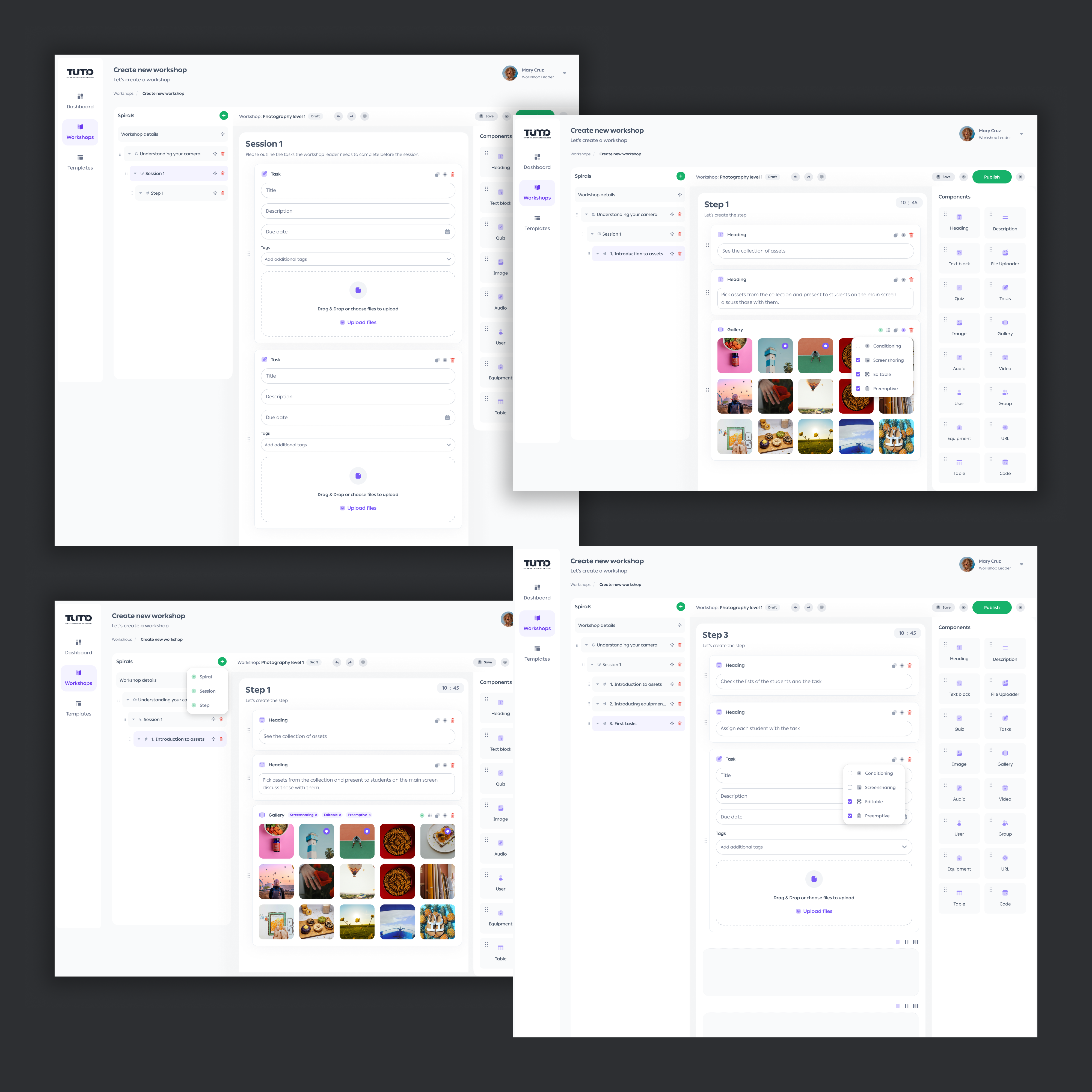
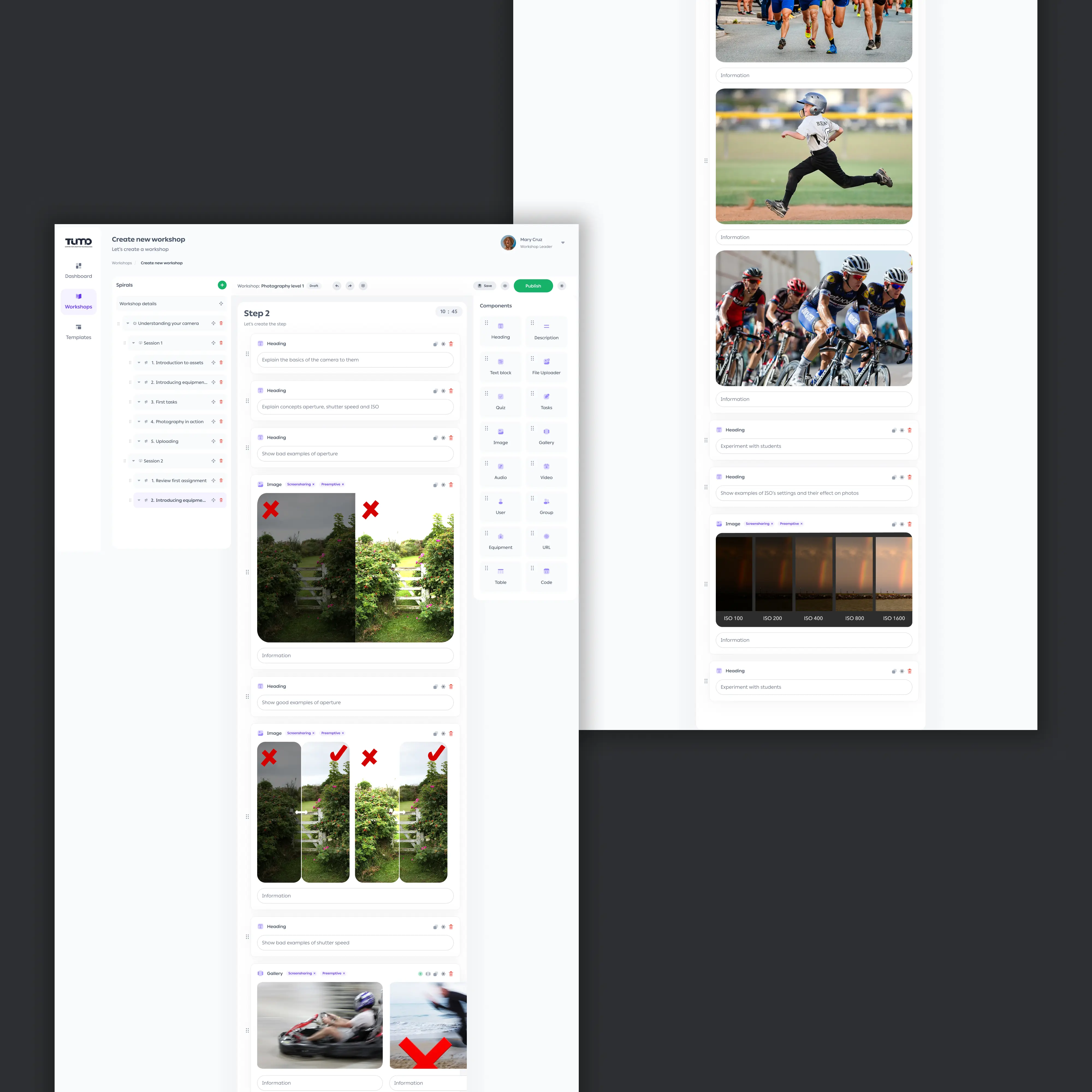
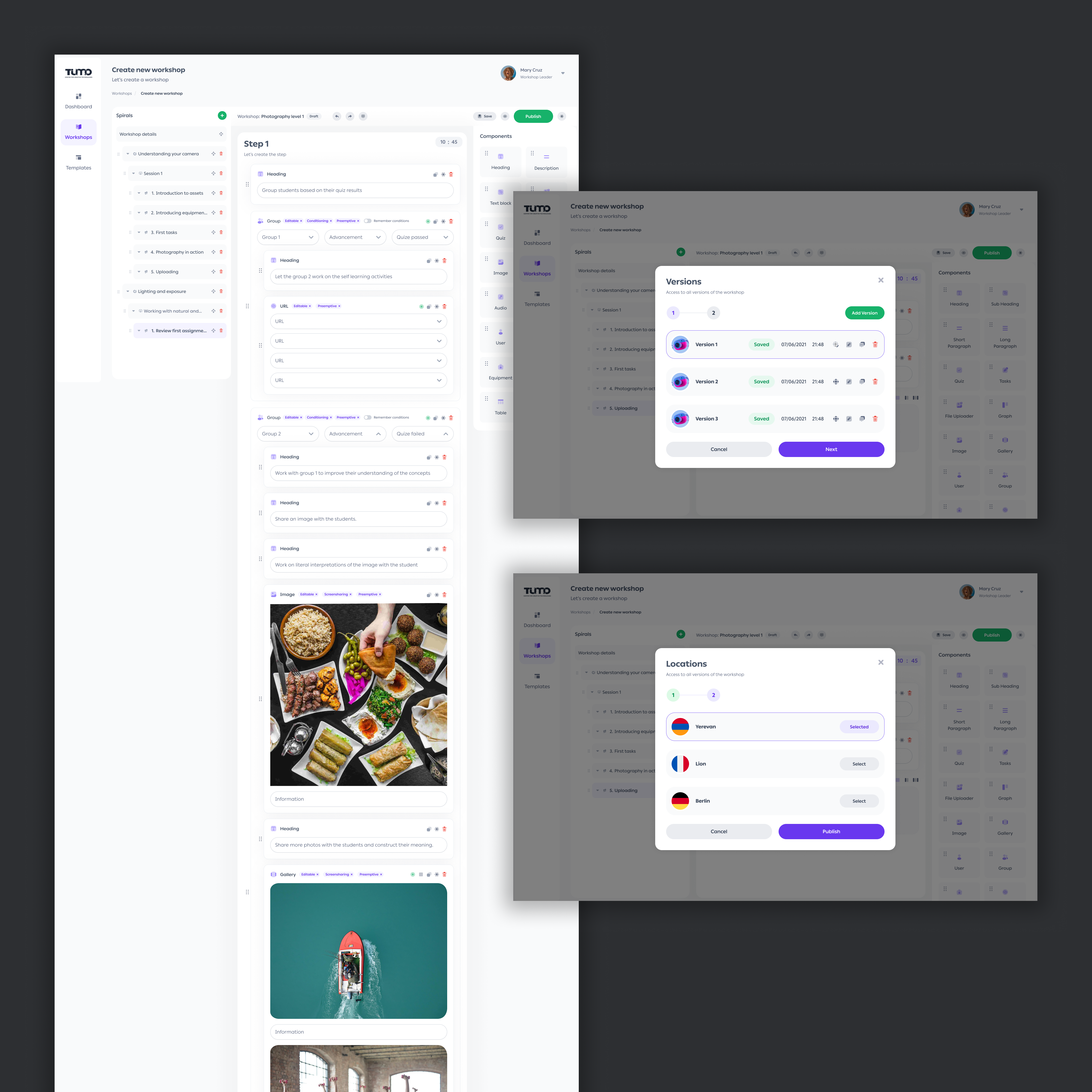
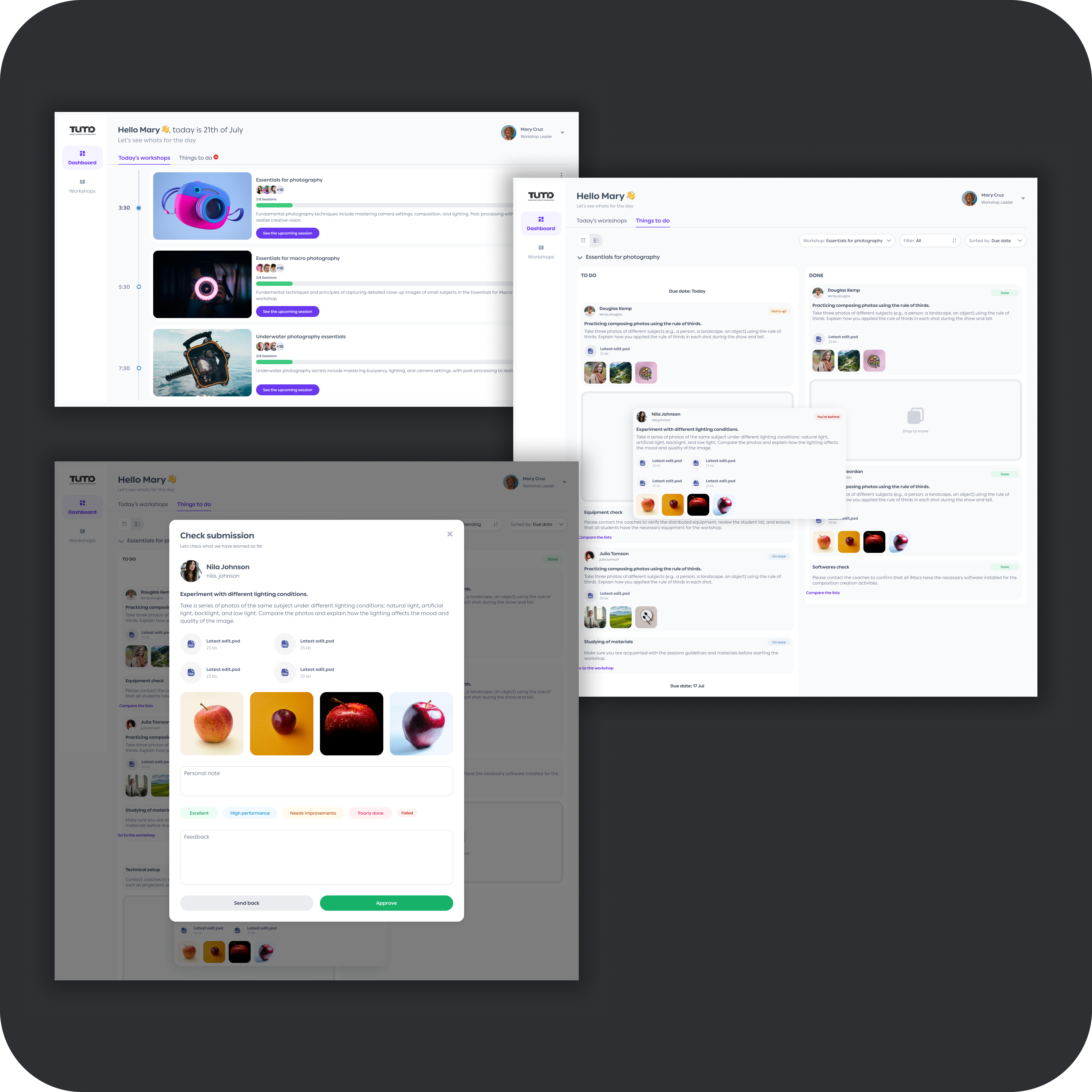
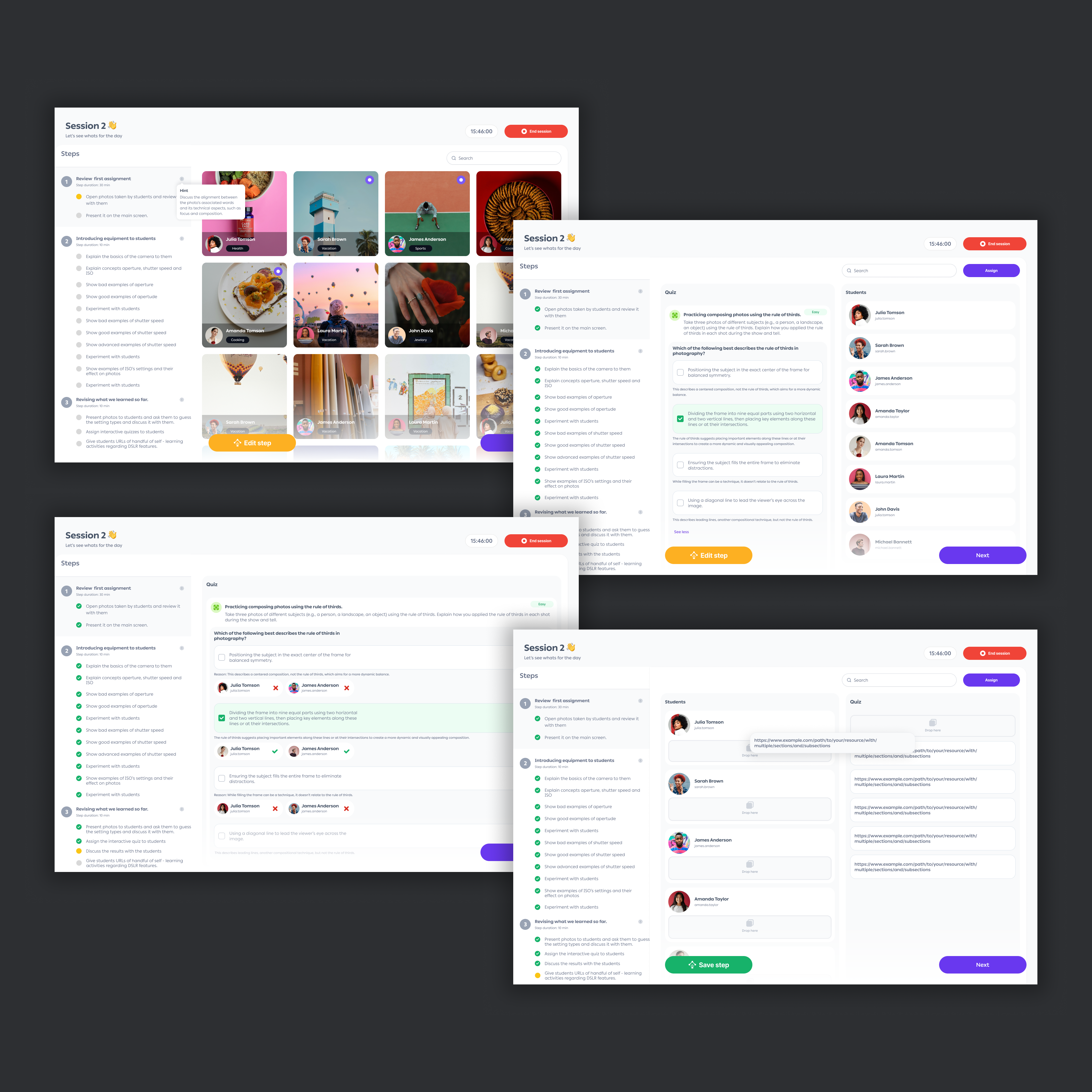
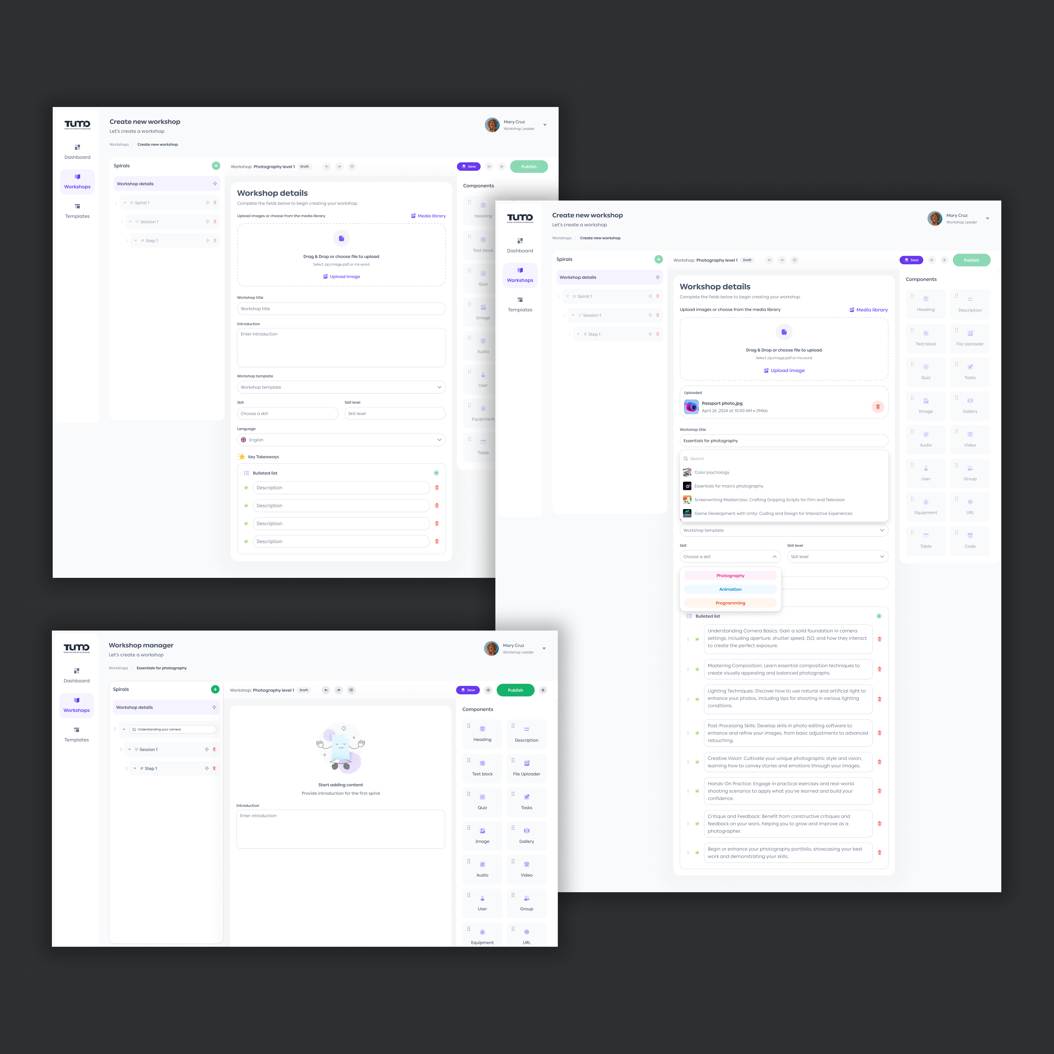
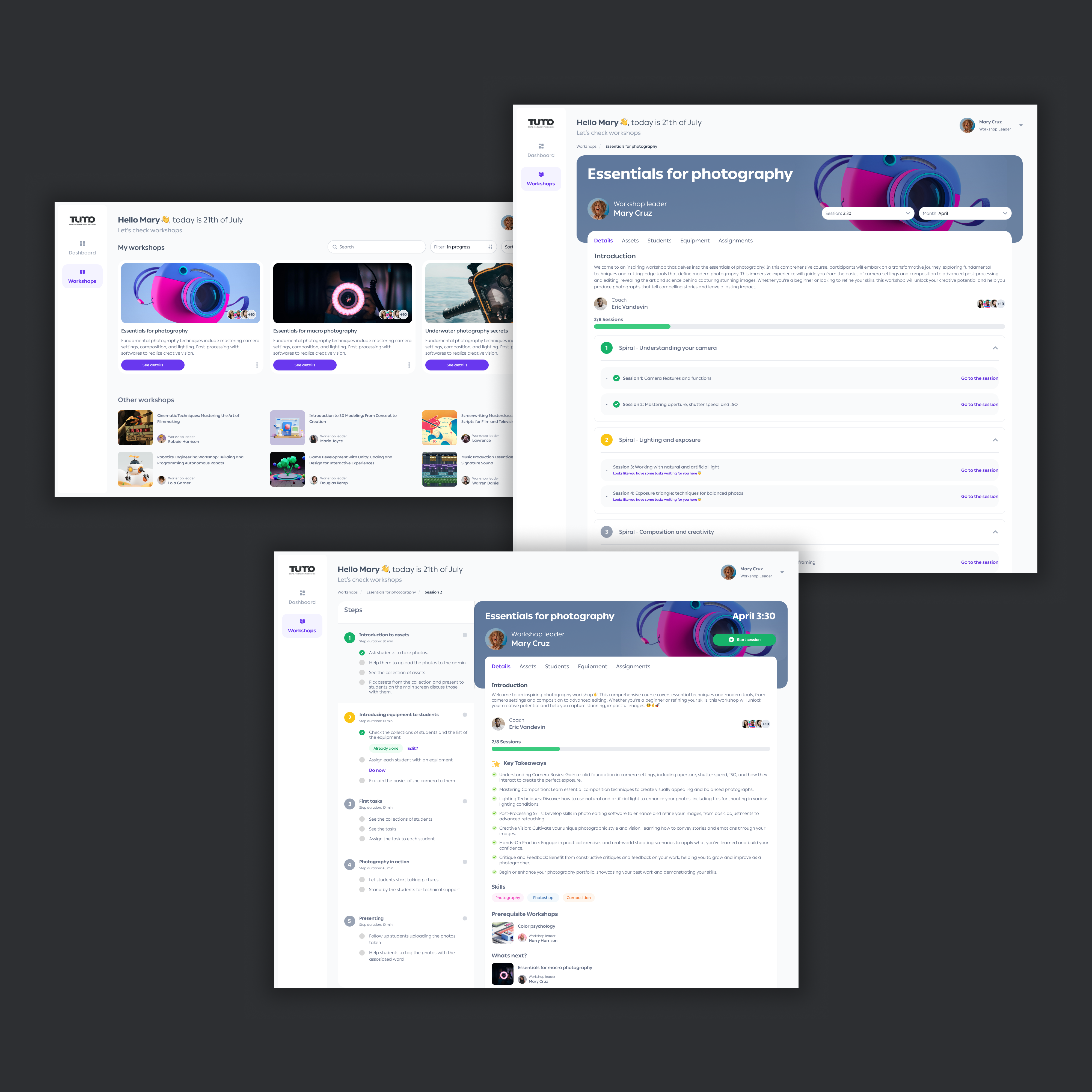
  • Workshop Designer and Leader experiences fully designed and handed off to engineering, validated through stakeholder walkthroughs, interactive prototypes, and workshop leader reviews
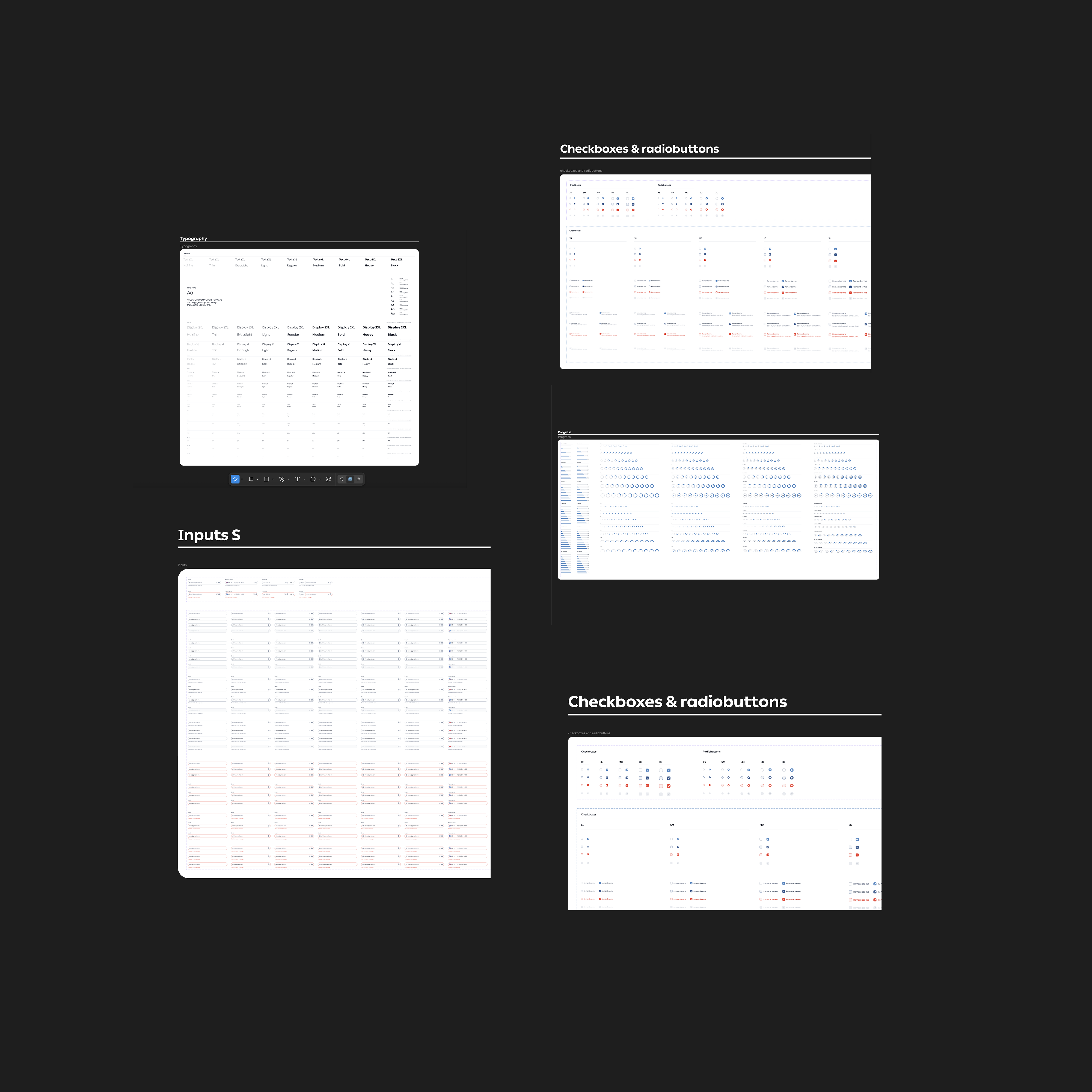
  • Design system established as shared foundation across Workshop 2.0 and all future TUMO products
  • Student experience fully scoped, designed, and documented, ready for Phase 2 engineering
  • Engineering implementation initiated. The product was in active development when I transitioned to Adobe
Scale · My Role

What I was designing, and who I was designing for

Having previously worked at TUMO, I had deep familiarity with the educational model and its operational challenges. As the sole designer on Workshop 2.0, I owned the full product lifecycle.

20,000+
Active students across all campuses
100+
Workshop leaders and educational staff
100s
Workshops spanning 6+ disciplines
7+
Campuses across Armenia
Product discovery
User research
Service blueprinting
Information architecture
UX strategy
Design system creation
Prototyping & testing
Stakeholder alignment
Engineering collaboration
Design QA
Success Criteria

How I defined success before design began

I proposed six measurable outcomes upfront, before any interface was designed. These became the filter for every decision that followed.

Instructor time recovered

Reduce session setup from 15–30 min to under 5 min per session.

Curriculum consistency

All groups follow an identical, versioned curriculum, with no instructor-to-instructor variation.

Attendance visibility

At-risk students flagged automatically within the session flow.

Centralised materials

Zero reliance on Drive, WhatsApp, or email for file distribution.

Accessible for all

WCAG AA compliance, usable by students with disabilities without workarounds.

Scalable foundation

Architecture supporting student portal, multi-campus rollout, and future products.

Product Principles

The framework behind every decision

Four constraints I used to evaluate options and push back when proposals conflicted with them.

🎯

Consistency over flexibility

Every student deserves the same curriculum regardless of instructor. The system enforces this.

🧠

Reduce cognitive load during live teaching

If a leader is thinking about the software, the design has failed. Every control had to earn its place.

📦

One source of truth

Content lives in one versioned system. Any instructor, any campus: same materials.

Accessibility by default

WCAG AA was a design constraint from the first component, not an afterthought.

Problem Discovery

What was actually broken

TUMO's students and instructors were one floor below. So I started by going downstairs. I sat in on live sessions, interviewed staff, and mapped how the work actually flowed before I opened Figma.

Observations
  • 15+ live workshop sessions
  • Multiple disciplines
  • Across ability levels
Interviews
  • 8–12 workshop leaders
  • 3–5 curriculum designers
  • 4–6 admin/ops staff
Activities
  • Workflow mapping
  • Journey mapping
  • Service blueprinting
  • LMS competitive review
FigJam — whiteboard brainstorming and requirements IA mapping
Early discovery: team whiteboard sessions mapping workshop leader flows, and requirements IA trees built from research findings
1

10–20 min lost per session on file access

Instructors routinely lost 10–20 minutes resolving file access issues before teaching could begin, up to a third of a 60-minute class.

2

15–30 min of manual prep per session

Session preparation meant jumping between Google Drive, WhatsApp, personal notes, and attendance sheets. No single tool held everything a leader needed.

3

Curriculum consistency was unenforceable

With 100+ workshop leaders and no shared content system, the same course ran differently across groups. I treated this as a structural equity failure, not an instructor problem.

4

Attendance flagging happened too late

Missed sessions weren't tracked reliably. At-risk students slipped through before any intervention was possible.

5

Accessibility was unaddressed

Third-party file workflows created real barriers for students with disabilities and low digital literacy. For an equitable education program, that was non-negotiable.

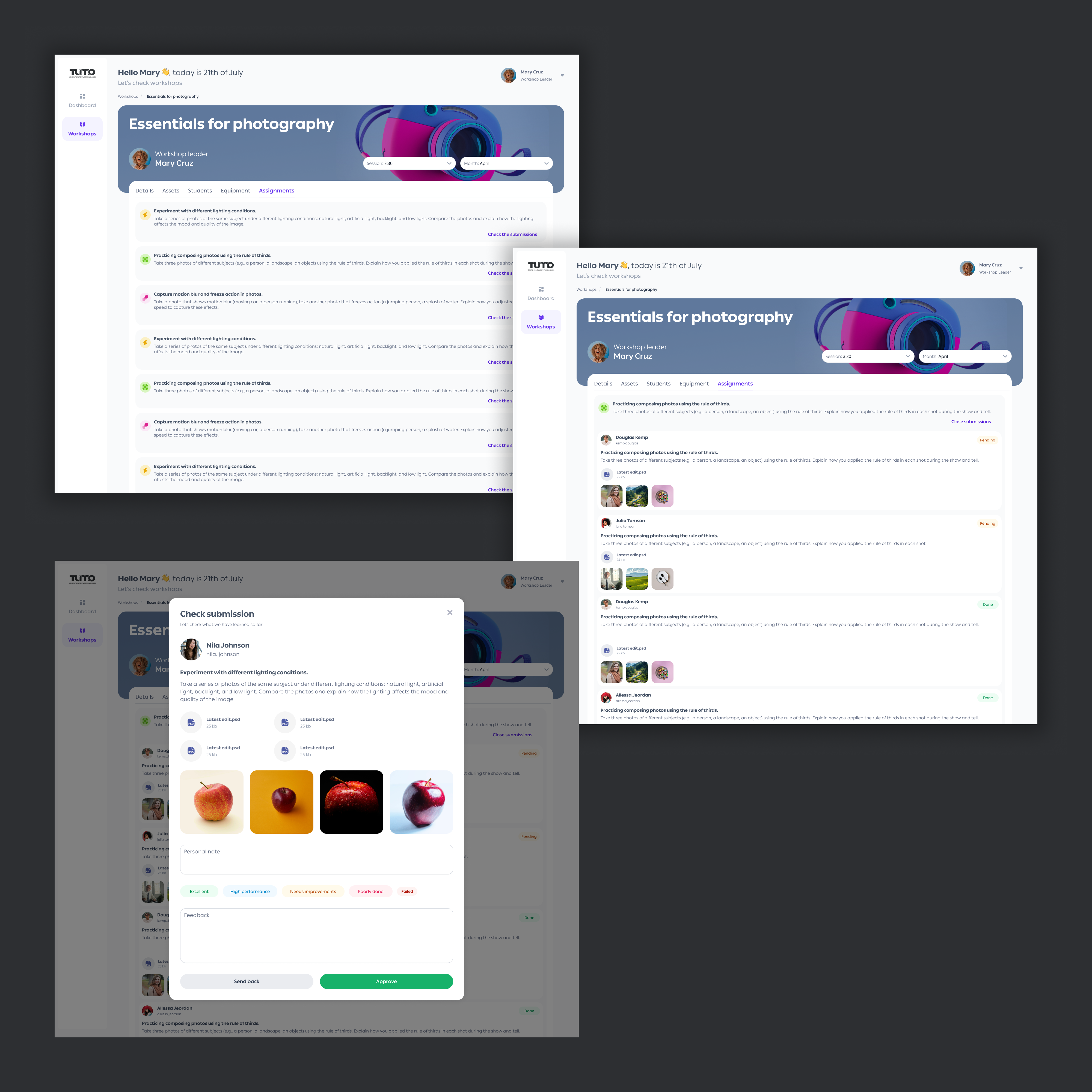
Before → After: A Typical Session

Before Workshop 2.0
  • Instructor hunts for session notes in personal files
  • Files shared via Drive link in WhatsApp group
  • 10–20 min consumed on file troubleshooting
  • Attendance on paper, often forgotten
  • No record of what other groups covered
After Workshop 2.0
  • Leader opens session, content pre-loaded by designer
  • Materials available in-platform, no third-party tools
  • Teaching begins within minutes of session start
  • Attendance logged in the session start flow
  • All groups follow the same versioned curriculum
Ecosystem

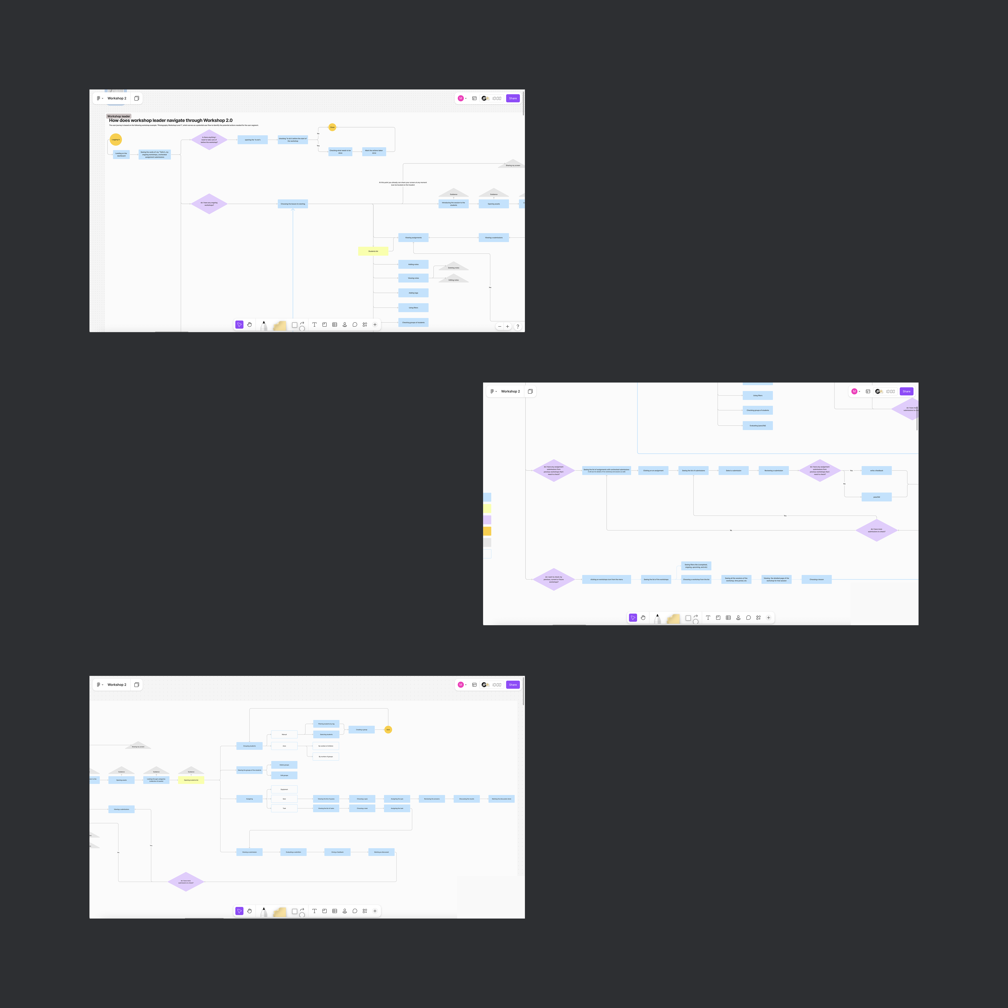
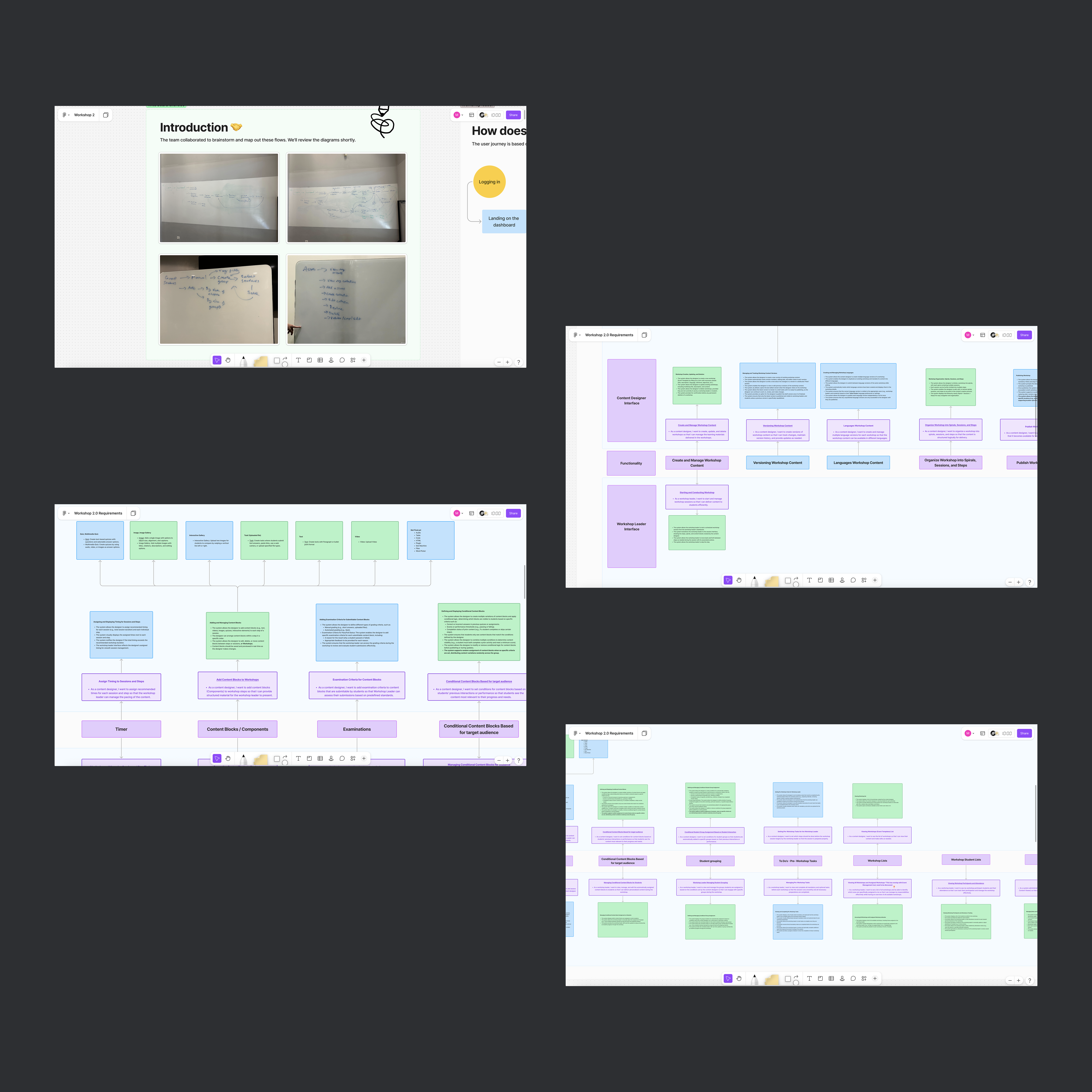
Mapping the system first

One of the first things I did was map how the workshop ecosystem actually worked: who touched what, in what order, and where it broke down. I used this map to align stakeholders and drive the core architecture decisions. Everything that followed, including role separation, dual-view, and milestone sequencing, traced back to what this diagram made visible.

ADMIN / FOUNDERS Set curriculum strategy WORKSHOP DESIGNER Creates content · Structures sessions Attaches materials Drag-and-drop builder · Versioning & publishing WORKSHOP LEADER Delivers live sessions · Speaker notes · Timer · Navigation Controls what students see in real time STUDENTS · 20,000+ Receive instruction · Upload work · Track progress Phase 2 — fully scoped, deprioritized for v1 BUILD PHASE LIVE PHASE DESIGN SYSTEM Styles & Tokens Components Icons & Illustrations WCAG AA Serves all TUMO products
Information Architecture

How each product is structured

The role separation went beyond a UX decision. It required two distinct information architectures, each optimised for a different context and a different cognitive load.

Workshop Designer
Workshop Designer
  • Sessions
  • Activities
  • Resources
  • Notes
  • Publishing
Workshop Leader
Workshop Leader
  • Dashboard
  • Session Delivery
  • Attendance
  • Student View
  • Materials

Workshop Designer's IA is built around authoring: creating, organising, and publishing content. Workshop Leader's IA is built around execution, everything visible from the moment a session starts to the moment it ends. A shared IA between these two would have compromised both.

Key Decisions

How the hardest decisions were made

I realized from direct observation that "the instructor" was actually two roles with opposite needs: a Workshop Designer building content ahead of time (needs a CMS-style builder) and a Workshop Leader delivering it live (needs a cockpit, not a dashboard). I proposed treating them as separate design problems, then defended that position through three contested decisions.

Decision 1: Unified interface vs. role-based separation

Should Workshop Designer and Workshop Leader share one interface, or have purpose-built tools?

Option A · Rejected
Single unified interface
Pros
  • Faster to build
  • Less engineering effort
  • One codebase to maintain
Cons
  • Mixed mental models for very different tasks
  • High cognitive load during live delivery
  • Constant context-switching
  • Can't optimise for either use case
Option B · Chosen
Role-based separate interfaces
Pros
  • Purpose-built workflows for each context
  • Minimal cognitive load during live sessions
  • Each interface can evolve independently
Cons
  • Higher engineering investment upfront
  • More design surface area to maintain
How alignment was reached

I created side-by-side workflow diagrams showing task complexity for each role under both approaches. An interactive prototype demonstrated the cognitive overhead a leader would face in front of a classroom with a unified interface. The evidence shifted the discussion from "less work to build" to "what actually works for the people using it." Resolved through structured tradeoff review with engineering and product leads.

Decision 2: Shared screen vs. dual-view architecture

Should instructors and students see the same interface during a live session?

Option A · Rejected
One shared view
Pros
  • Simpler to implement
  • Easier to QA
Cons
  • Students exposed to instructor controls
  • Cluttered, confusing experience for learners
  • Instructor distracted managing student-facing view
Option B · Chosen
Dual-view architecture
Pros
  • Clean, focused learning experience for students
  • Instructor retains full context without exposing it
  • Better classroom management and pacing
Cons
  • Higher implementation complexity
  • Two surfaces to design and maintain
How alignment was reached

This required the most stakeholder work. The CEO and CPO had strong views about what students should see. I brought classroom observation data and a clickable prototype showing both views side by side. The key framing: "A student should never feel like they're looking at a management tool." Once leadership experienced the prototype, the conversation shifted from debate to refinement.

Workshop Leader — live session execution and dual-view proof
Live session in action: step execution with gallery view (top left), and the dual-view proof, "The section is being shared to the main screen" (top right), showing the projected student view separately from instructor controls

Decision 3: Ship student portal in v1 vs. sequence it as v2

Should the student-facing experience be part of the first release?

Option A · Rejected
Build everything in v1
Pros
  • Complete end-to-end system from day one
  • Students benefit immediately
Cons
  • Engineering capacity insufficient for full scope
  • Risk of delaying instructor tools already needed
  • Student experience depends on instructor flows working first
Option B · Chosen
Milestone sequencing: instructor flows first
Pros
  • Instructor workflows are prerequisite infrastructure: delivery has to work before students have anything to receive
  • Student experience built on a validated foundation
Cons
  • Students wait longer for their experience
  • Requires maintaining scope discipline over time
Outcome

Student portal is fully scoped, designed, and documented, ready for Phase 2 engineering. While engineering capacity influenced sequencing, the primary driver was product dependency: curriculum creation and delivery needed to be established before a student-facing experience could succeed.

Stakeholder Management

Leading through disagreement

On a 0→1 project with founders involved, every major decision was contested. I aligned three groups with conflicting priorities using evidence, prototypes, and structured tradeoff framing.

StakeholderTheir positionResearch showedHow I resolved it
Engineering teamUnified interface; use existing librariesCreation and delivery require opposite UX paradigmsWorkflow diagrams + prototype showing cognitive load. Milestone framing.
CEO / CPOResistant to dual-view; conflicting views on student featuresStudents confused by management UI in observed sessionsSide-by-side prototype. Framed as student experience, not technical complexity.
Workshop LeadersWanted maximum flexibility; worried about losing autonomyUnstructured flexibility caused cross-group inconsistencyShowed prep time savings. Positioned as collaboration model, not control.
Validation

How decisions were tested

No decision was final until it was tested against the people it would affect. I used five methods across the project to validate before committing to build.

Stakeholder walkthroughs
Interactive prototypes
Workshop leader reviews
Founder reviews
Engineering feasibility sessions

The dual-view architecture and role-based separation, both contested, were validated through clickable prototypes before any engineering work began. Prototypes weren't polish; they were proof.

FigJam — Workshop Leader navigation flow diagrams
Flow mapping: "How does workshop leader navigate through Workshop 2.0," used to define and validate navigation architecture before prototyping
Solution · Workshop Designer

The content builder

Using a drag-and-drop builder, designers assemble sessions from modular blocks: lesson structure, instructor notes, materials, exercises, and timing guides. Every session becomes a versioned, publishable artifact, the single source of truth for every group running that workshop.

Workshop Designer — 3-panel builder interface
Workshop Designer: spiral hierarchy sidebar (left), content editor with workshop details (centre), component library panel (right)

Design rationale

Why drag-and-drop?

Workshop content is inherently modular. Sessions break into distinct segments (intro, instruction, exercise, wrap-up), each with its own materials, timing, and notes. Drag-and-drop matches this mental model directly: building a session means assembling parts, not writing a document.

I considered and rejected three alternatives:

Free-form editor (Google Docs style) Template library only Slide deck metaphor
Why versioning?

Live cohorts need stability. A change to session 3 shouldn't disrupt a group that's currently mid-course on an earlier version. Versioning separates authoring state from published state: updates are staged and published deliberately. A change is never pushed to an active session without intent.

Workshop creation flow (click to enlarge)
Solution · Workshop Leader

The live delivery interface

I designed this interface around one constraint: the instructor's attention belongs to the students, not the screen. Every feature had to justify its presence.

FeatureProblem it solvedOutcome
Feature
Speaker notes
Problem

Leaders relied on printed notes and personal documents, which were inconsistent and often forgotten or out of date

Outcome

Contextual guidance embedded in the session, visible only to the instructor

Feature
Per-segment timer
Problem

Session pacing drifted between groups: the same course ran anywhere from 45 to 90 minutes

Outcome

Consistent timing across every group, every campus running the same workshop

Feature
Session navigation
Problem

Leaders frequently lost track of session position mid-delivery, breaking teaching flow

Outcome

Always-visible session structure reduced cognitive load and recovery time

Feature
Dual student view
Problem

Students saw instructor controls and admin UI, which confused them and undermined the classroom dynamic

Outcome

Students see only lesson content; instructor retains full management context

Feature
Attendance panel
Problem

Attendance logged on paper, often after-the-fact or not at all

Outcome

Checked in at session start, inside the instructor's primary workflow, with no separate step

Workshop Leader — dashboard, today's workshops, assignment review
Workshop Leader dashboard: today's sessions at a glance, to-do queue, and the submission review modal with rubric tags and approve/send back actions
Workshop Leader — workshop grid and session detail view
Active workshops grid and session detail: spiral hierarchy, progress tracking, session/month selectors, and Go to session navigation
Session execution
Workshop Leader — assignments tab and submission review modal
Assignments: submission list with Pending/Done status, and the review modal with rubric tags (Excellent, High performance, Needs improvements) and approve/send back actions
Scaling Beyond Workshop 2.0

Building the foundation

Workshop 2.0 was one of several TUMO products in development at the same time. I proposed building a shared design system (TUMO DS) rather than designing each product in isolation. More upfront investment; far more value over time.

TUMO Design System — logos, colors, dropdowns, buttons, tables, radiuses
TUMO Design System: logo system, color tokens, dropdown variants, button library, table components, and border radius scale
TUMO Design System — typography, inputs, checkboxes, progress indicators
TUMO Design System: typography scale, input field variants, checkbox and radio components, progress indicators
Design tokens Component library Icons & illustrations WCAG AA Component status tracking Contribution guidelines

The system serves Workshop 2.0, the learning path product, the student portal, and future TUMO tools. Accessibility was a constraint, not a checkbox: every component was built to serve students with disabilities from the start.

Service Blueprint

How the system works end to end

I created this blueprint to map every actor, action, and dependency across the workshop lifecycle, which turned abstract role debates into concrete system dependencies.

Service Blueprint: Workshop 2.0 Lifecycle
PRE-SESSION SESSION START LIVE DELIVERY POST-SESSION STUDENT Phase 2 Enrolled in workshop Receives session link Views instructor content Uploads work · Gets feedback — LINE OF INTERACTION WORKSHOP LEADER Reviews session content Opens presentation modeLogs attendance Navigates sessionsMonitors timer per segmentViews speaker notes Reviews submissionsProvides feedback — LINE OF VISIBILITY WORKSHOP DESIGNER Builds session structureWrites instructor notesAttaches files · Sets timing Publishes versioned contentLocks session for live use Not present (backstage) Reviews session dataIterates on next version — LINE OF INTERNAL INTERACTION PLATFORM SYSTEMS Content storageVersion controlFile management Session initialisationAttendance loggingStudent list sync Dual-view renderingTimer enginePermission layer Submission storageFeedback threadsAnalytics (Phase 2) DESIGN SYSTEM TUMO DS — Styles · Components · Icons · WCAG AA Shared across all TUMO products Workshop 2.0 · Learning Path Student Portal · Future products 10–20 min file setup
Architecture

Dual-view architecture

The most technically complex decision was the dual-view architecture: one session, two completely different interfaces. The instructor controls what they see, and separately, what students see. This diagram shows how the permission and rendering layer works.

Dual-View Session Architecture
SESSION ENGINE Permission layer Content routing State management INSTRUCTOR VIEW Full session content Speaker notes Per-segment timer Navigation controls Attendance panel Admin tools STUDENT VIEW Lesson content only Current slide / material Exercise prompts File access No instructor controls No admin tools Instructor controls what students see Instructor's screen Students' screens ↑ shared session state ↑
Reflection

What I'd do differently

I'd formalise the service blueprint earlier. The ecosystem map and workflow diagrams emerged through the project. Having them sharper at the start would have shortened every stakeholder alignment conversation.

I'd also push for a lightweight analytics baseline before launch. Without session completion data, it's impossible to know which parts of the system need iteration first. That's the biggest open question I'd want answered.

What I Learned

  • Educational systems require balancing consistency and autonomy: enforce structure too rigidly and you break trust; leave it too open and you break equity.
  • Organisational alignment is often harder than interface design. The most important prototypes I built were for stakeholders, not users.
  • Architecture decisions determine scalability long before implementation begins. Getting role separation right early made everything downstream easier.

Tools & Methods

Figma TUMO Design System Contextual inquiry Instructor interviews Workflow mapping Journey mapping Service blueprinting Prototype testing LMS competitive review