Case Study · Content Discovery

Picsart: Taxonomy & Categorisation

Transforming Picsart's Discover experience from creator-centric feeds into a taxonomy-driven discovery system.

Senior Product Designer Picsart iOS · Android · Web 🚀 Shipped
DISCOVER User interviews Competitor analysis ARCHITECT Taxonomy tree Content categorisation DESIGN Discovery experience Personalization model VALIDATE Usability testing Shipped to production
At a Glance
Company Picsart
Product Content Discovery: Taxonomy & Categorisation
My Role Senior Product Designer · Research · IA · Interaction design · Validation
Platform iOS · Android · Web
Users Consumers and prosumers: creators, solopreneurs, small businesses, marketers
Key Decision Build a browsable taxonomy tree rather than improving the hashtag system. Users needed structured pathways, not more tags.
Outcome 2.5×+ editing engagement target exceeded · Shipped across iOS, Android, and web · Consumers and prosumers served in one unified taxonomy
Why This Mattered
Problem

Users couldn't distinguish templates, effects, and community content. Consumers left without editing. Prosumers couldn't find relevant content. The Discover screen had been built for people publishing, not people trying to find.

My Contribution

I led the project end to end: research, taxonomy architecture, discovery experience design, and validation across iOS, Android, and Web. I made the core structural call that set the direction: taxonomy over improved hashtags.

Outcome

A browsable taxonomy that organized Picsart's content library by type, use case, and intent. Editing engagement exceeded the 2.5× target set at project kickoff. Both user segments are served within one unified experience.

The Solution
One taxonomy serving two audience segments.
Taxonomy architecture · Discovery experience · Personalization system
Click above for more detail
Picsart content taxonomy tree overview
Information Architecture
Content taxonomy tree organizing Picsart's library into browsable, intent-driven categories
Picsart redesigned Discover screen
Discovery Experience
Redesigned Discover screen with clear content type differentiation and structured navigation
Personalized content discovery on Picsart
Personalization
Preference-matched content packaging that aligns what users want with what the library holds
Outcomes

What shipped and what changed

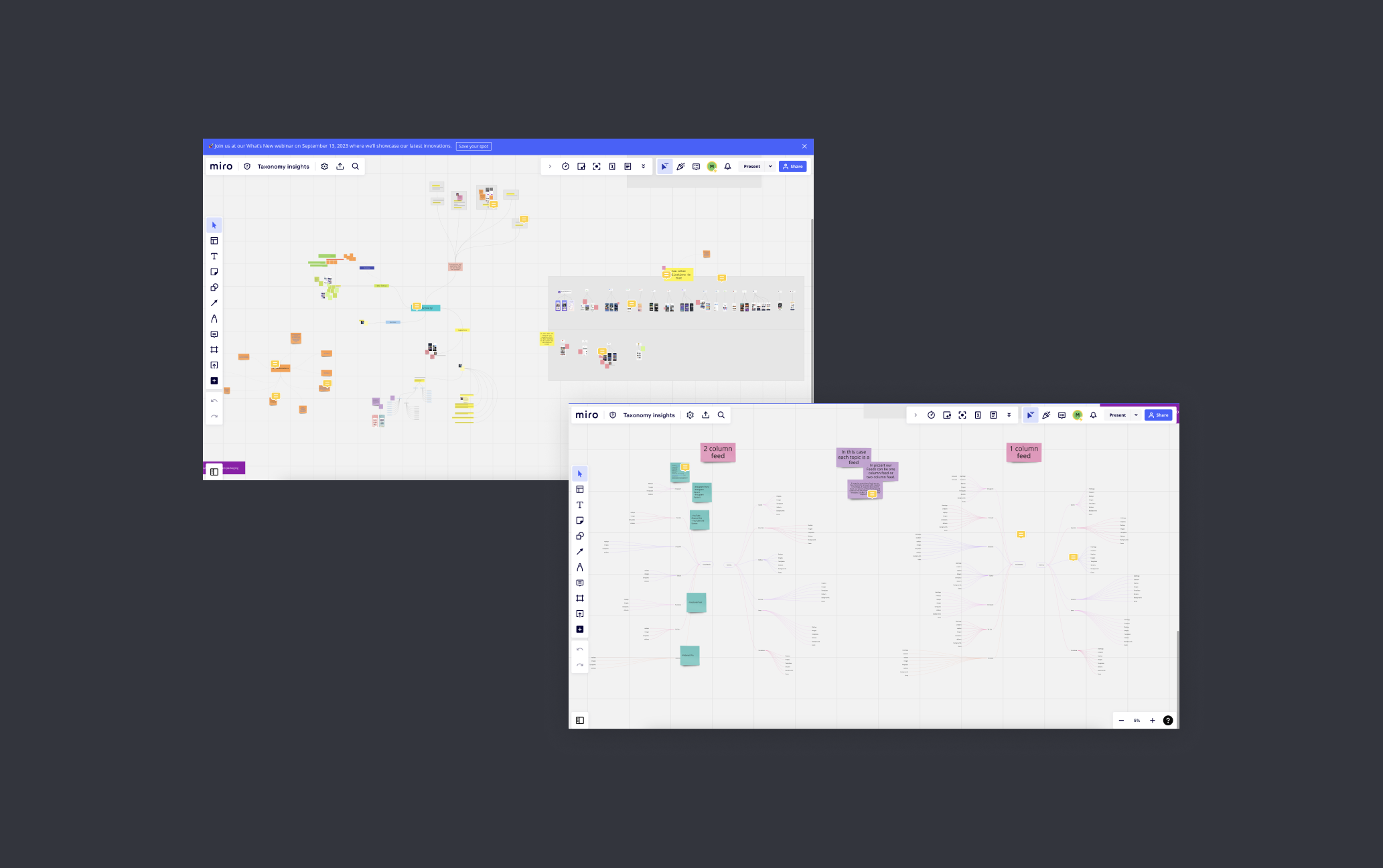
The project had four KPIs set at kickoff: editing engagement, discovery rate, subscription growth, and prosumer engagement. The redesigned taxonomy shipped across iOS, Android, and web.

  • 2.5×+ editing engagement target exceededThe primary KPI at project kickoff. Editing actions from the Discover surface exceeded the target at launch.
  • Taxonomy shipped across iOS, Android, and WebOne taxonomy architecture deployed consistently across all three platforms, with no fragmented experiences or platform-specific compromises.
  • Unified consumer and prosumer discovery into a single architectureBoth audience segments navigate the same taxonomy. Personalization handles relevance. No parallel experiences to build or maintain.
  • Enabled personalization on top of structured content classificationPersonalization was possible because the taxonomy gave the algorithm something structured to work with. Structure first, algorithm second.
  • Established scalable taxonomy foundation for future content typesThe architecture was built to absorb new content types without structural redesign: a platform investment, not just a UX refresh.
Final Designs

The redesigned Discover experience

Click to enlarge
Design walkthroughs
Feed architecture — navigation, layout, and content tagging
Design Principles

What I held to across every decision

🏗️

Architecture before personalization

You can't personalize your way out of a structural problem. Before the recommendation engine could help, the content needed to be organized in a way that made intent-based navigation possible. Structure first, then the algorithm has something to work with.

🎯

Design for intent, not identity

Splitting the product by user type (prosumer vs. consumer) would have imposed a false structure. Users shift between casual browsing and professional intent within the same session. The taxonomy had to serve what someone was trying to do, not who the system had classified them as.

Creative actions belong in discovery

Picsart's differentiator isn't the content library. It's what users can do with it. Remix, Replay, and Regenerate needed to appear during discovery, not after someone had navigated two levels into the editor. Surfacing them while browsing was the call.

📐

Scalability is a design requirement, not an afterthought

A taxonomy built around today's content library would be outdated the moment Picsart shipped something new. The architecture had to accommodate new content types and use cases without needing a structural redesign every product cycle.

Problem Discovery

The Discover screen was built for creators. Most users were trying to find things.

150M+
Users in the Picsart ecosystem
2.5×+
Editing engagement target exceeded at launch
2→1
Audience segments unified in one taxonomy
0→1
Taxonomy built from scratch — no prior classification existed
3
Platforms shipped · iOS · Android · Web

Picsart's content library is broad: templates, assets, effects, and community content across every creative use case. But the Discover screen had been designed around the people who contributed that content, not the people trying to find it.

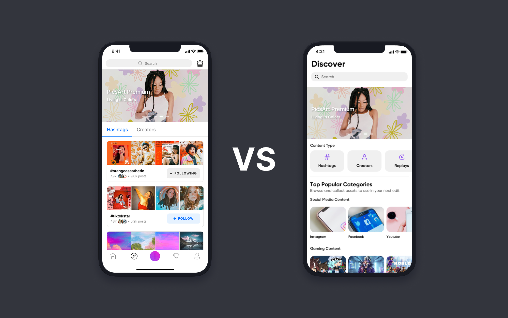
Consumers browsed through hashtag feeds and followed individual creators. That worked if you knew what you were looking for and who made it. For everyone else, the experience stalled. Templates, community posts, effects, and backgrounds were visually indistinguishable. Users scrolled, found nothing that clicked, and left without touching any editing feature.

Prosumers had a different problem. They came with professional intent: marketing materials, social assets, business templates. The existing system had no concept of use case or intent. It surfaced everything to everyone and relied on relevance to emerge on its own.

The research suggested the issue was content organization rather than content quality.

Before the redesign
  • Hashtag-based navigation that served content publishers, not content finders
  • No differentiation between content types: templates, community posts, and effects looked the same in the feed
  • Prosumers couldn't surface their work to relevant audiences or find content matched to professional use cases
  • Generic content recommendations with no connection to individual preferences or past behavior
  • Save was the only prominent action. Remix, Replay, and editing tools were effectively invisible.
  • Users left Discover without engaging with any editing feature
After the redesign
  • Browsable taxonomy organized by content type, use case, and user intent
  • Clear differentiation between categories: users navigate directly to what they need
  • Prosumer and consumer content coexist in one unified taxonomy, with personalization handling relevance
  • Preference-matched content packaging tied to onboarding signals and past behavior
  • Creative actions surfaced inline: Remix, Replay, and Regenerate visible at the point of discovery
  • Editing engagement exceeded the 2.5× target set at project kickoff
Workshop Designer — 3-panel builder interface
Level of contend discovery problems and milestones
Research Findings

What the research kept pointing back to

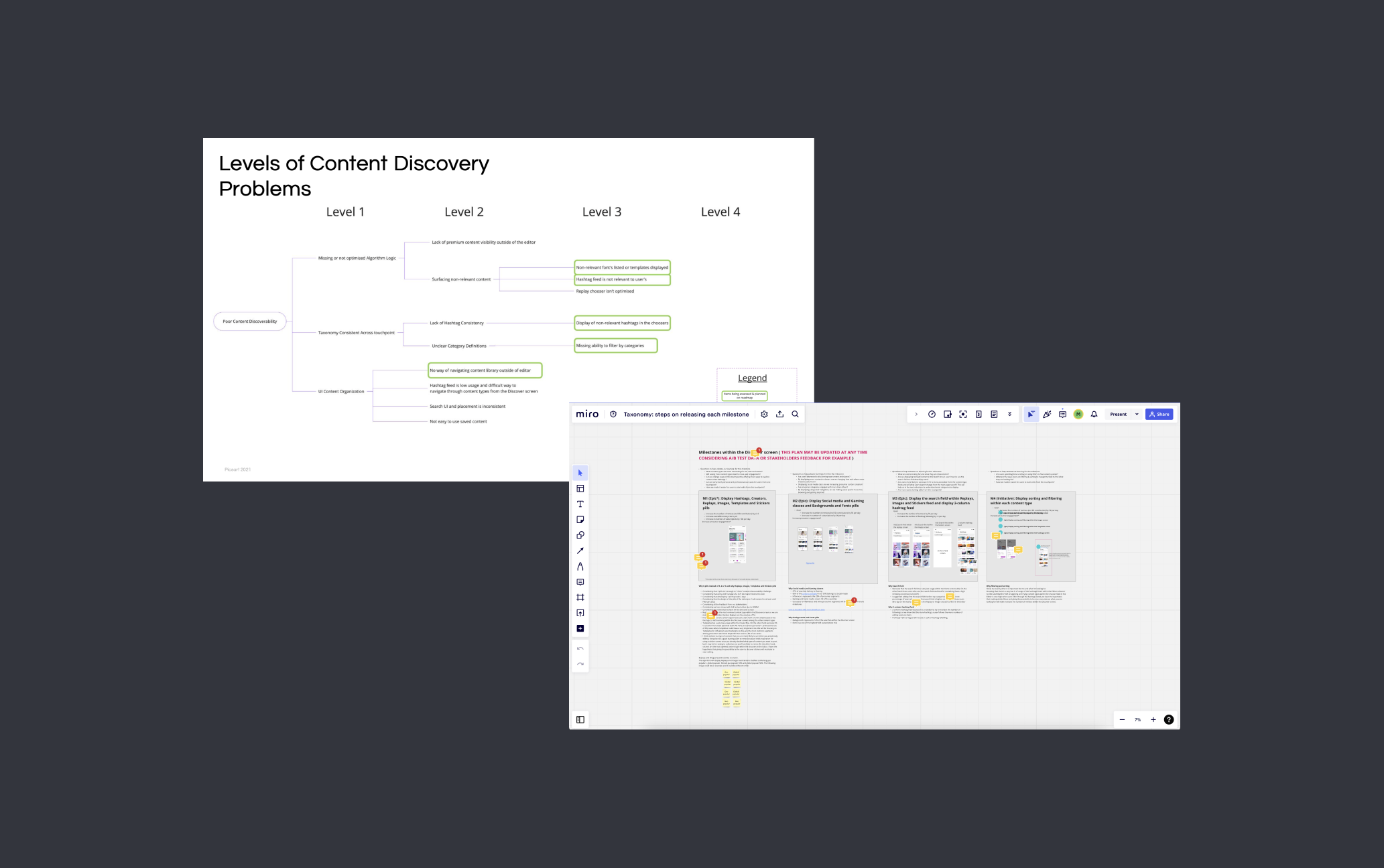
I ran four research methods across the project. They produced different kinds of signal, but they converged on the same diagnosis: Picsart had a content organization problem, not a content quality problem.

1

Users couldn't tell content types apart

Templates, community posts, effects, and backgrounds looked identical in the feed. Users described the experience as "disorganized," not because the content was bad, but because there was no way to navigate toward what they actually wanted.

2

Hashtag-based discovery was built for the wrong end of the transaction

The existing system was optimized for people publishing content. Users trying to find content for a specific project had no structured path. They either followed individual creators or gave up. Neither behavior drove editing engagement, which was the product's core metric.

3

Prosumers needed use-case alignment, not just more content

Advanced users came to Picsart for professional creative work: marketing assets, social campaigns, business materials. The feed had no concept of creative context or intent. Remix, Replay, and Regenerate (the features that made Picsart useful for this kind of work) were undiscoverable inside the editor, let alone from Discover.

4

Personalization alone wouldn't fix a structural problem

Users wanted content matched to their interests. But a better recommendation engine on top of an unstructured system would just surface the wrong content more efficiently. The taxonomy had to come first. Without it, personalization had nothing to work with.

Research Process

Research methods and findings

Each method was designed to answer a specific question. Together, they built the evidence base for the core architectural decision.

User Interviews
  • One-on-one sessions with prosumers and consumers
  • Goal: Understand what each segment was trying to do in Discover, and where the experience stopped working
  • Surfaced the gap between creator-centric navigation and intent-driven discovery
  • Prosumer frustration with professional use-case alignment was the clearest signal
Surveys
  • Distributed to a broader cross-section of users for quantitative signal
  • Measured satisfaction, content relevance, and navigation friction across the product
  • Finding: Content discoverability and organization were the highest-friction areas for both segments
Usability Testing
  • Participants asked to complete specific discovery tasks in the existing app
  • Observed where navigation broke down in practice
  • Finding: Users repeatedly tried to filter by content type, and couldn't
  • Content type confusion was the most consistent failure point across sessions
Competitor Analysis
  • Reviewed how comparable platforms handled content categorization and discovery at scale
  • Goal: Identify patterns worth inheriting, and patterns Picsart needed to avoid
  • Informed the taxonomy structure and navigation hierarchy
Key Decisions

Two decisions that shaped the architecture

The research pointed to a structural problem. Structural problems have competing solutions. These were the two calls I had to make and defend with evidence.

Why the taxonomy problem was hard

Picsart's content library spans millions of user-generated assets (templates, backgrounds, effects, stickers, community posts, and typographic assets), none of which had ever been classified under a shared taxonomy. The difficulty wasn't organizing them into categories. It was that each type brought a different mental model, browsing behavior, creator ecosystem, and intent state. The taxonomy had to reconcile all of them in one navigable structure, without splitting the product or making the experience feel generic for everyone.

Competing tensions
  • Casual inspiration browsing vs. professional template discovery
  • Community-generated content vs. curated editorial assets
  • Serendipitous scrolling vs. intent-driven filtering
  • Creator publishing model vs. consumer discovery model
The constraint
  • One taxonomy, not separate experiences per segment
  • No existing classification system to build from
  • Personalization on top: structure had to work before the algorithm could
  • Deployed simultaneously across iOS, Android, and Web
Picsart content taxonomy tree — full architecture overview
The taxonomy tree, organizing Picsart's content library by type, use case, and intent for the first time.

Decision 1: Build a content taxonomy vs. improve the hashtag system

Should we redesign content discovery from the architecture up, or invest in improving the existing hashtag and creator-based system?

Option A · Rejected
Enhanced hashtag system
Pros
  • Lower engineering lift, building on existing infrastructure
  • Familiar navigation pattern for users already using hashtags
  • Faster to ship than a new taxonomy architecture
Cons
  • Hashtags are user-generated and inconsistent: more of them doesn't fix the underlying organization problem
  • The core issue is structural: users can't navigate by intent or content type, not that there aren't enough hashtags
  • Prosumers have fundamentally different needs that hashtag feeds were never designed to serve
  • Doesn't create the concept of "content type" in the system; it just adds more tags
Option B · Chosen
Browsable taxonomy tree
Pros
  • Addresses the root cause: a content organization problem, not a search problem
  • Gives users structured pathways by content type, use case, and creative context
  • Scalable: new content can be classified into the taxonomy as the library grows
  • Enables personalization to work correctly by giving the algorithm structured categories to operate within
Cons
  • Significant IA and design investment to build from scratch
  • Requires content classification work across an existing library
How I reached this decision

The usability test results were the deciding input. Users consistently tried to filter content by type and failed, not because the filter was broken, but because the organizational model didn't support type-based navigation at all. Improving hashtags wouldn't create that concept. A taxonomy would. I built the case with the testing data and got alignment to pursue the taxonomy before moving into design.

Decision 2: Unified taxonomy vs. segmented experiences by user type

Should prosumers and consumers get separate Discover screens tailored to each segment, or share one taxonomy with personalization handling relevance?

Option A · Rejected
Segmented experiences per user type
Pros
  • Each segment gets content optimized specifically for their needs
  • Simpler personalization logic: no need to reconcile competing use cases in one surface
Cons
  • Doubles the design and engineering surface to build and maintain
  • Picsart users shift between casual and professional modes; classifying them permanently is a false distinction
  • Cuts off the value of prosumer content for consumers who browse aspirationally
  • Creates two products where one should exist
Option B · Chosen
Unified taxonomy with personalization signals
Pros
  • One content library, one architecture: coherent experience regardless of how someone is using the app that day
  • Personalization handles relevance without fracturing the product into parallel tracks
  • Prosumer and consumer content can coexist: consumers discover professional-grade content alongside accessible templates
  • Single surface is easier to iterate and measure
Cons
  • Personalization model needs enough behavioral signal to differentiate effectively across user modes
  • Higher design complexity: one system has to feel right for two very different intent states
How I reached this decision

The research made it clear that the prosumer/consumer split was messier than it looked. Consumers occasionally wanted professional templates. Prosumers browsed casually before switching into project mode. A hard segmentation would have imposed a structure users don't actually operate within. The unified taxonomy with personalization was the more honest model of how people actually use the product.

The Solution

What the taxonomy delivered and why it mattered

Each element of the redesigned Discover experience connects directly to a documented user problem from the research.

Feature Problem it solved Outcome
Feature
Browsable taxonomy tree
Problem

Users had no structured path to find content by type or use case: discovery depended on knowing a hashtag or following the right creator

Outcome

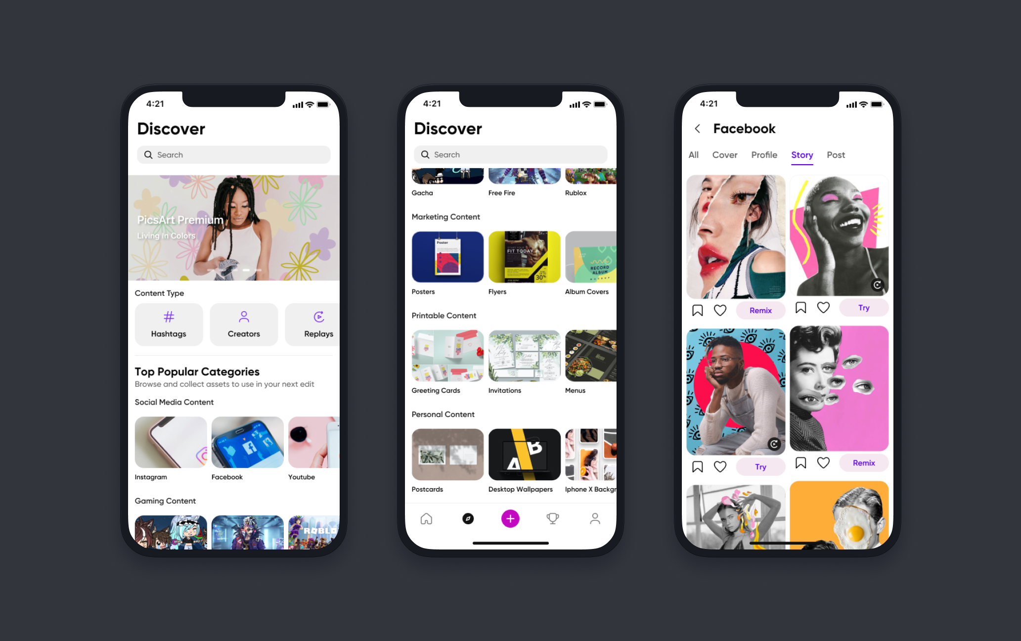
Clear navigation by content category, use case, and creative context, findable without requiring search terms or creator knowledge

Feature
Content type differentiation
Problem

Templates, community posts, effects, and backgrounds were visually indistinguishable in the existing feed

Outcome

Clear labeling and visual distinction between content types: users know what they're looking at before they tap

Feature
Prosumer content pathways
Problem

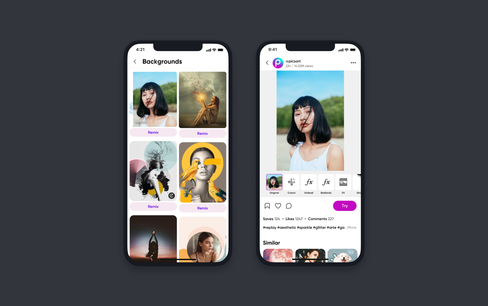
Professional-grade content and tools (Remix, Replay, Regenerate) were buried and undiscoverable for advanced users

Outcome

Dedicated taxonomy categories for professional use cases: marketing materials, social assets, business templates, and the tools to remix them

Feature
Personalized content packaging
Problem

Content recommendations were generic, unconnected to individual user preferences or past behavior

Outcome

Taxonomy-anchored personalization that matches content to user interests within the structured navigation, without collapsing the architecture

Feature
Creative action visibility
Problem

Save was the only prominent CTA; editing capabilities that differentiate Picsart were invisible from the Discover screen

Outcome

Inline creative actions surfaced within the taxonomy experience, turning discovery into a direct entry point for editing

Feature
Use-case content for influencers and marketers
Problem

Business users needed content mapped to professional contexts (marketing materials, social assets, printables) and couldn't find them

Outcome

Use-case categories in the taxonomy covering social media assets, marketing materials, and business content, alongside inspiration for influencer creative work

Validation

How each direction was tested before it moved forward

I didn't present a single recommendation and ask for sign-off. Every major decision was validated before it advanced: research, testing, and iteration at each stage.

User interviews: prosumers and consumers
Surveys: content relevance and navigation friction
Usability testing: task-based sessions on the existing Discover screen
Competitor analysis: taxonomy and navigation patterns at scale
Prototype testing: redesigned Discover screen concepts
Iterative rounds before final engineering handoff

The combination of qualitative interviews and quantitative surveys gave me clear evidence for every structural call. No decision in this redesign came from a preference or an assumption.

Reflection

What I'd do differently

The taxonomy didn't just organize content. It changed how users engaged with it. A 2.5× increase in editing actions was evidence that structure unlocks behavior: when people can find what they're looking for, they do something with it.

The taxonomy solved the right problem. What I underestimated was how much content classification work would emerge after the architecture was approved: edge cases that only surface when real content is being placed into real categories at scale.

The research was solid. Four methods gave me clear signal, and I had alignment on the core decision (taxonomy over improved hashtags) before design began. That alignment held throughout the project, which is the thing I'd work hardest to replicate.

What I'd change is how early I brought content operations into the process. A taxonomy tree is a design deliverable. Making it work as the library grows requires a classification model and an operational process for new assets. I got there, but later than I should have. On a project like this, information architecture and content strategy need to start at the same time, not one after the other.

What I learned

  • Content architecture and personalization have to be sequenced correctly: structure first, algorithm second
  • Designing for intent rather than user identity avoids building parallel experiences that require double the maintenance
  • Taxonomy work doesn't end at delivery: classification at scale needs an operational model, not just a design spec
  • Research that combines qualitative interviews with quantitative surveys gives you a more complete picture than either alone, especially when they point in different directions
  • Feature visibility is a discovery problem, not just an onboarding problem. Surfacing Remix and Replay in the feed did more than any tooltip ever would.

Tools & Methods

Figma Looker Loom Miro User interviews Surveys Usability testing Competitor analysis Prototype testing